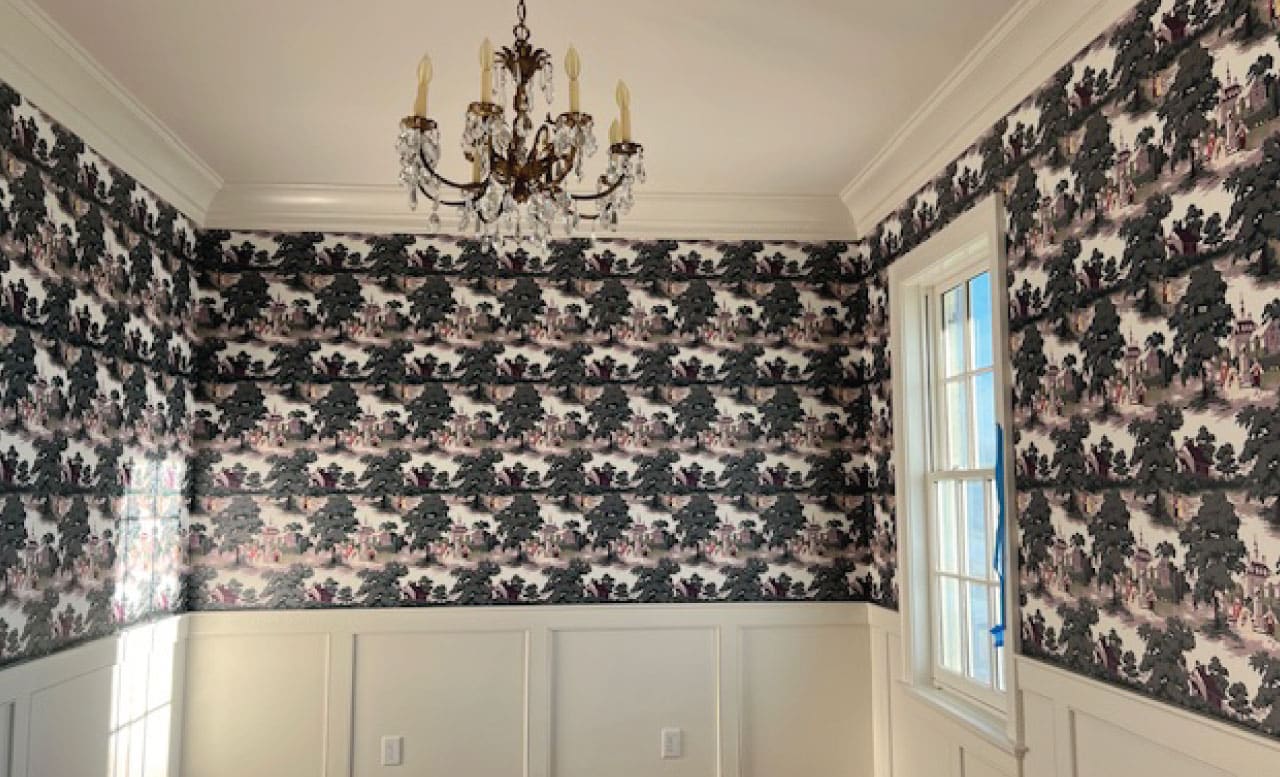
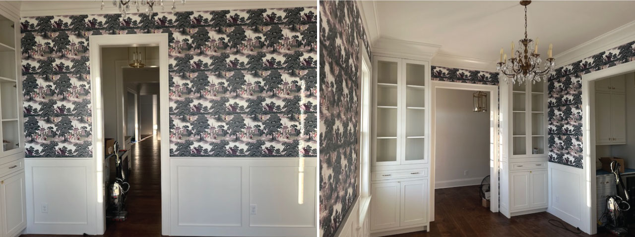
The following email was written to us by a homeowner looking to recreate wallpaper from a photograph:
“I am hoping and praying you’ll be able to work with this photo. I grew up with this wallpaper being in my grandmother’s home. They tore it all off when she remodeled in the 80s - and to my knowledge, no one has a piece of it. I remember loving it so much - and I would love to wallpaper with this recreated version in my new dining room in our new home that we are building to continue family traditions like Thanksgiving and Birthdays with the same wallpaper we remember growing up.”
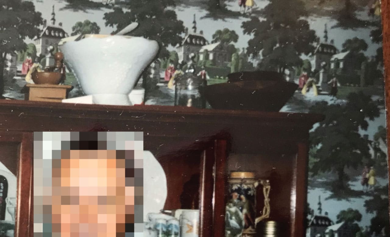
Prognosis: Old Victorian motif. In fair condition but also blurry and incomplete
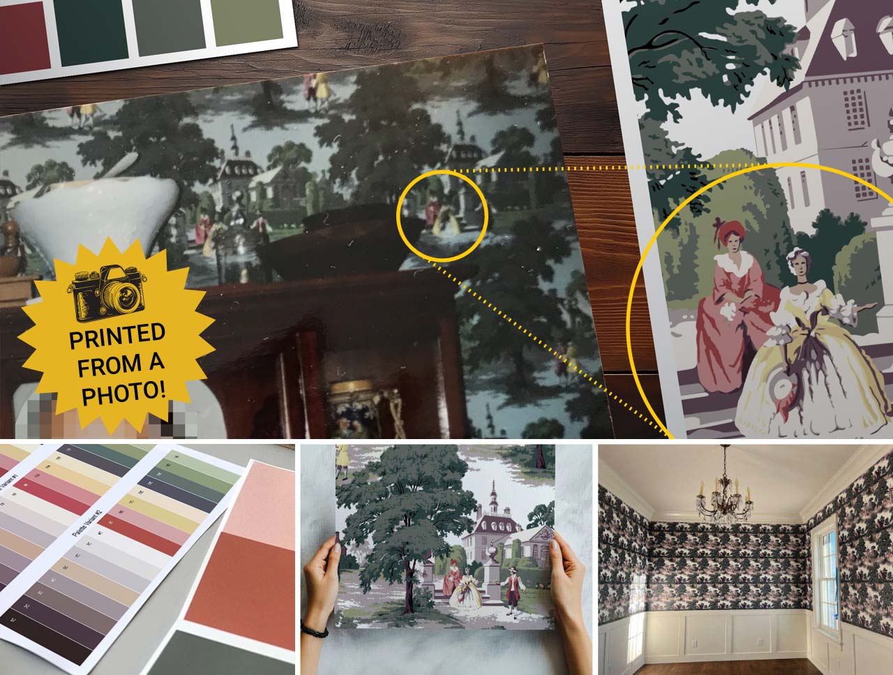
As you can see, our only reference point for this pattern was a picture taken of their family members with the wallpaper pattern appearing slightly blurry in the background of the shot. It was clear from the start we’d have our work cut out for us, but this level of difficulty is something we find exciting to take on.
The Reproduction Process
Technology Used to Restore This Wallpaper:
- Printer: Mimaki UCJV 300-160
- Material: Dreamscape Nolar
- Inks: UV-Cured CMYK for Durability and Fade-Resistance
- Reconstruction: Adobe Illustrator
- Final Effects: Adobe Photoshop
Step 1: Rebuilding & Re-Imagining
Below is the actual resolution and starting point of our creative process:
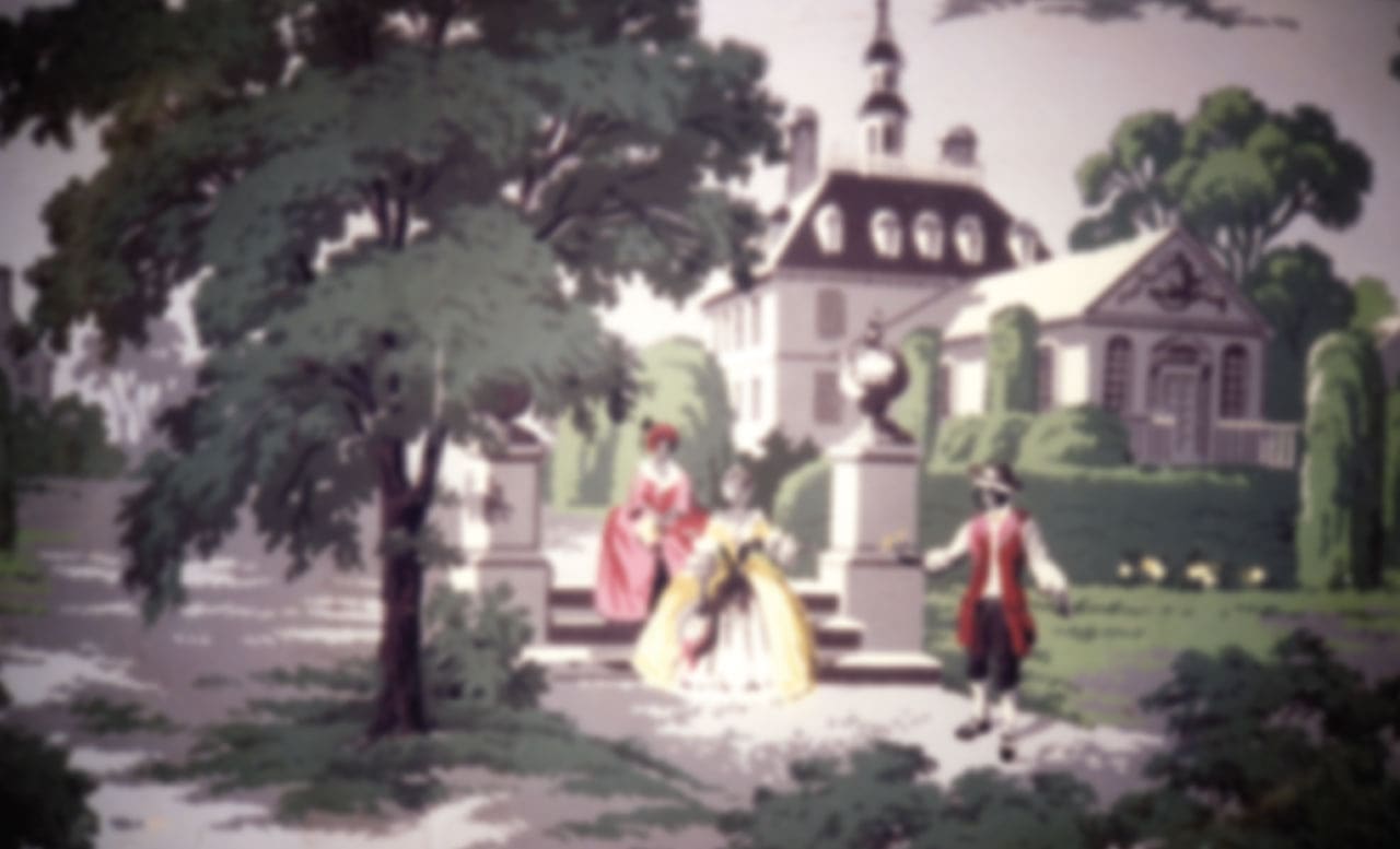 Enhanced image but it still needs significant work
As of today there is no magical plugin or AI tool that can convert photos into digital files suitable for modern printing. For this particular task nothing compares to the human eye or the hand of an artist.
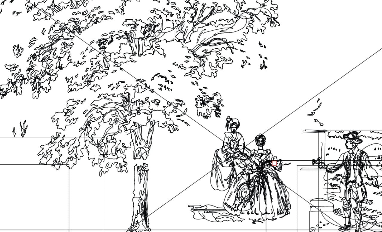 Screenshot of Illustrator in ‘Outline Mode’, revealing the artist’s work
This aspect of the replication process is critical requiring each detail to be recreated by hand while keeping the colors grouped and organized for future matching. As much as we love automation and digital software, there’s no substitute for the artist or graphic designer when reproducing a client’s vision.
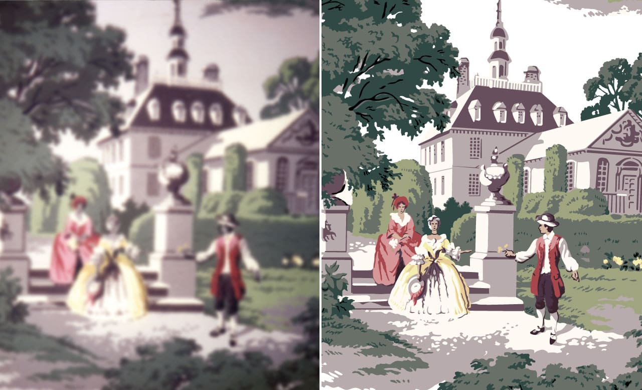 A closer look at the difference beteen source (left) and illutration (right)
We were given a separate reference point for the incomplete portion of the design from another photo. As you can see below, this area was the most challenging portion to reconstruct
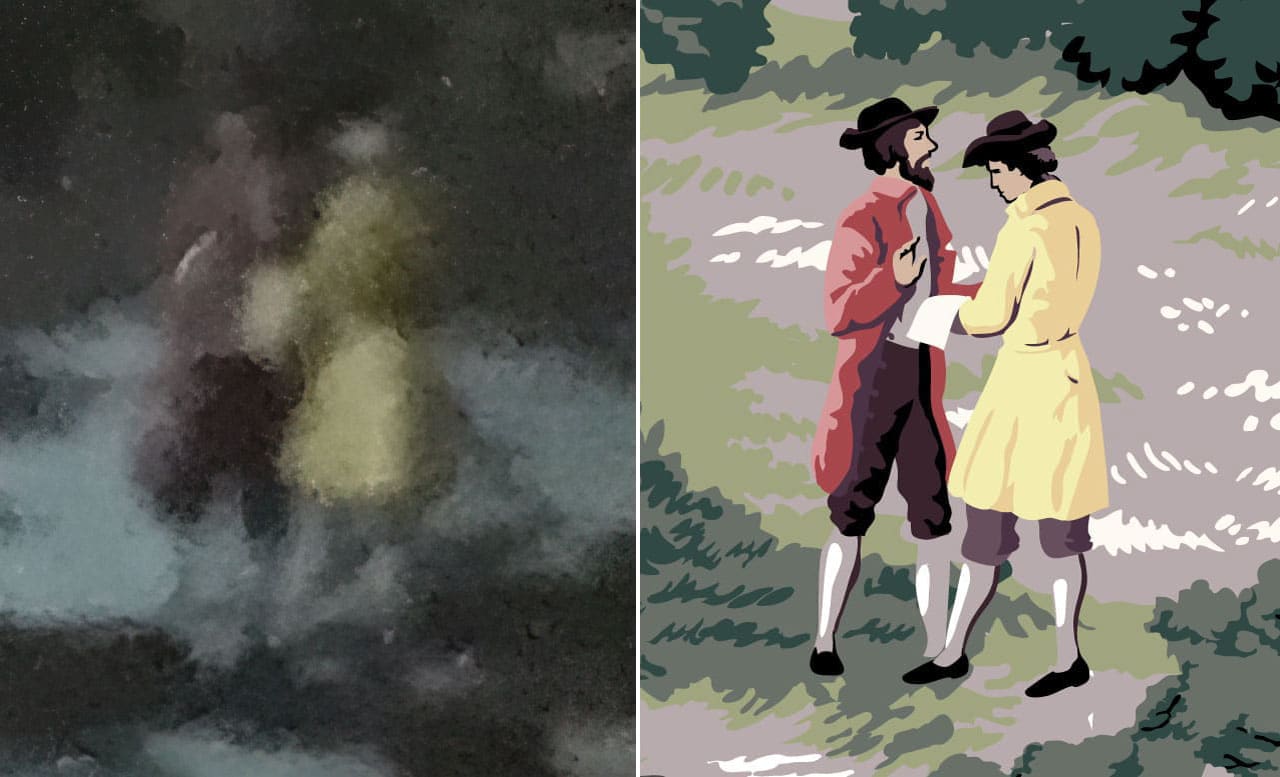
The rest of the image was used as references for style and fashion to generate the missing details.
We sent out a screenshot of our progress and the client was happily surprised to see their cherished design being restored to such a level. They couldn’t believe what we were able to create from their photos and promptly gave us the green light for the next phase.
Step 2: Printing Press Proofs
We output their full design at 100% scale on the material of their choosing, so they got an accurate preview of how their rolls will look. This step is important for them to review all details of the illustration.
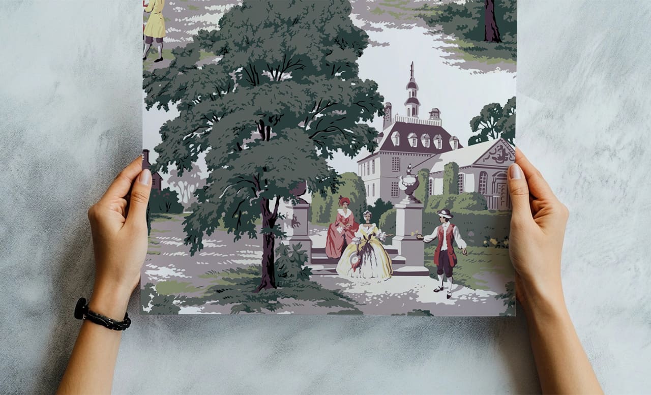
The first round of proofs were met with great enthusiasm, even the colors were spot on. However there was one small critique: the client felt the illustration was too sharp and modern looking, recalling a “softer” feel of the original. So we did the only logical thing and printed out a few options with varying amounts of blur applied. This was our one and only need for Photoshop and its excellent Gaussian Blur filter.
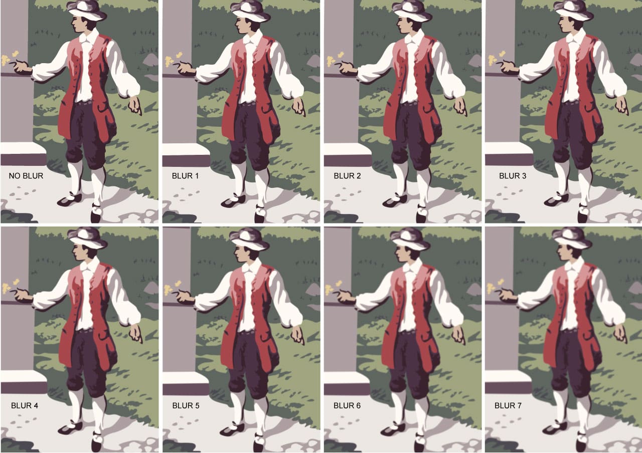 Eight different levels of blur applied, in 2% increments for a gradual effect.
They chose option #1 right away; and with final confirmation attained, we were ready to get the presses rolling.
Step 3: Color Separation
The hard work completed in step 1 is most appreciated at this stage. The creative team was diligent about grouping and organizing the colors in a straightforward fashion as the artwork was created.
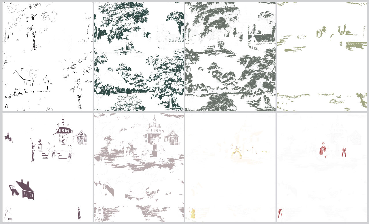
Placing each individual color on its own layer gives us a lot of flexibility and control, which is vital for completing the next phase.
Step 4: Color Matching
Usually this process involves us matching against an existing sample or specific colors requested from a professional color libary. However, since this artwork was built from a photo we had to find an alternative method of presenting colors.
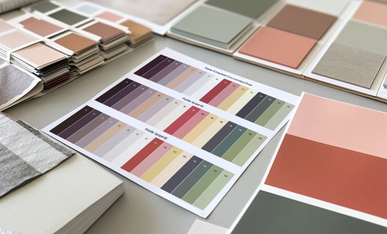 Colorbooks and textiles help visualize the color combinations
The client loved the second palette of colors and gave us the green light to start printing.
Step 5: Printing
We produced over 400 square feet of this wallpaper. It was more than twice the required amount, however the client made the wise choice of purchasing a backup roll in case the house should face any damage, or they decide to paper another room with their favorite pattern.
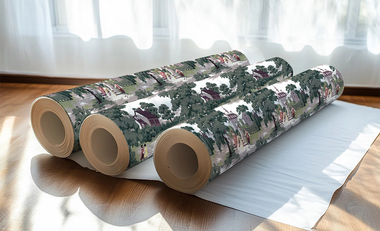 PRO TIP: Always buy more wallpaper than you think you need. It comes in handy!
Lessons Learned
Each job we take on presents opportunities to build our skill set and improve our service for future clients:
- Yes, we can reconstruct elaborate patterns from terrible photos. This was by far the worst picture, but we are proud of the results.
- Not every client wants sharp graphics. It’s nice to provide softer options, especially for antique patterns.
- It really pays to look at similar references from the era. Researching Victorian vignettes and motifs helped us to fill in some of the creative blanks.
- Few things are more gratifying than helping a family feel at home and connected to their loved ones.
