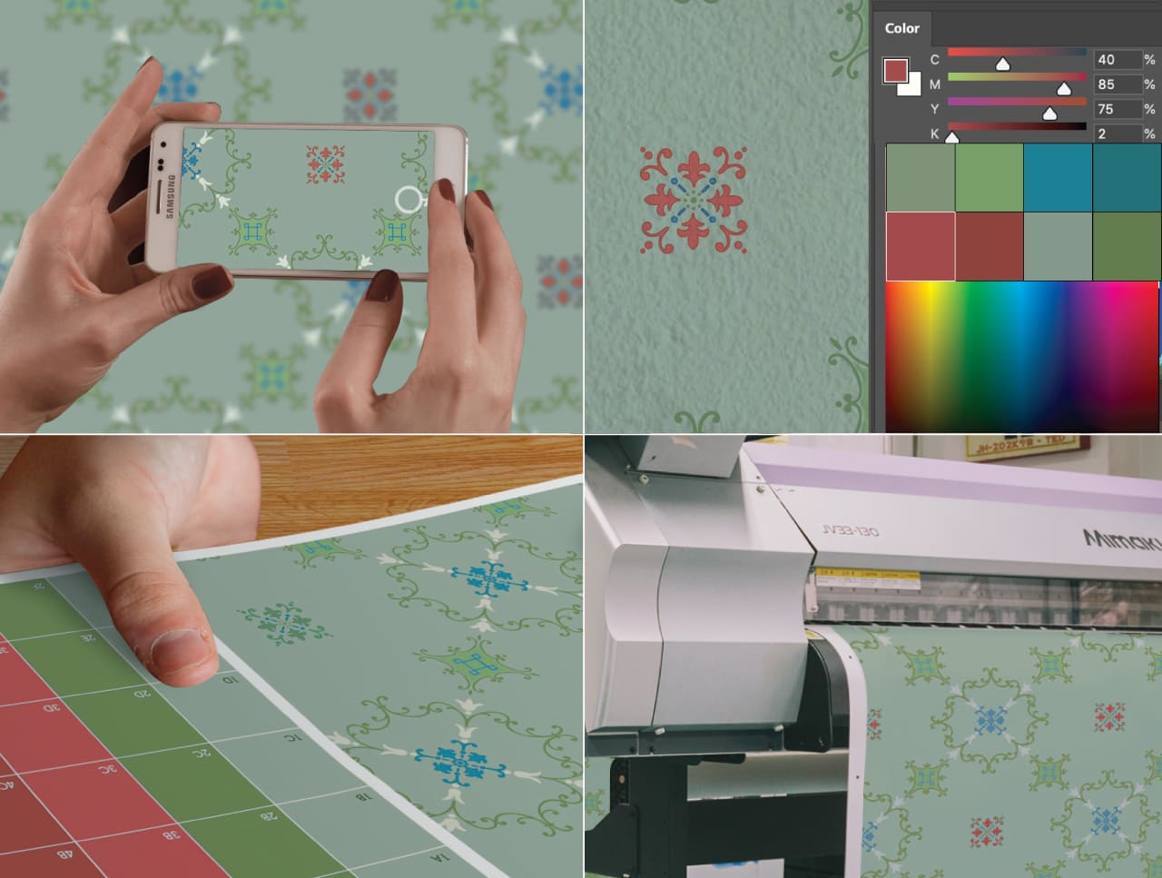
Fine Print is proud to announce a new addition to our blog, covering the unique and creative challenges of wallpaper reproduction.
The Backstory
We’ve printed a lot of wallpaper over the years. Most of our early work was built around modern custom wallpaper designs. People would send us something they liked, mostly from stock sites or hiring a graphic designer - we’d print it out and that would be the end of the transaction.
However, over time a trend began to emerge. We were seeing a lot less new designs and far more requests for reproducing old ones. A scrap of wallpaper from a grandparent’s house, a vintage print with water damage, a photo of wallpaper that no longer exists - the demand for these services inspired us to open up a whole new division staffed with designers and retouch artists.
During this process we accumulated a specialized skill set. The learning curve was steep but also fascinating. We quickly realized that no two jobs are the same, but all of them usually share a few key concerns:

Dirt, Dust & Grime
Any wallpaper that has been up for more than 10-20 years is bound to collect a lot of residue. After scanning a sample at 800dpi and zooming in to 400%, it becomes apparent that we can’t do anything with most samples without removing every last speck of dust, hair, fading and stains. Any scuff marks, wrinkles or other signs of aging are also removed.
Incomplete Samples
There are cases where parts of a pattern may be too damaged, or completely missing in order to make a faithful recreation. This type of reconstruction requires ingenuity, creative problem solving, and the ability to draw and imitate a large variety of styles. Thankfully our team of designers and illustrators are up to the task. We’ll be exploring their case studies in depth on this blog.
Color Matching
It sounds so simple - you take two colors and you match them. Done! If only it were that simple. The truth is that color matching is an artform of its own (link to our article here). There are many factors to consider:
- Lighting conditions where comparisons are being made
- Matching an existing installation, whose color likely has shifted over time.
- The stock/finish of the paper, which may or may not add warmth to the overall tone
- The number of colors that require a match
- The intricacy of the design itself
To overcome these obstacles, our job is to separate each color. Sometimes this can be done with software, though many cases require our artists to mask them out by hand.
This entire process can take an afternoon or several days/weeks depending on these variables. We’ve definitely nailed a lot of samples on the first try, but many designs, especially those with more than 4 colors usually require multiple rounds of press proofs and clear communication with the client to stay on the same page.
Adapations & Remixes
There are special cases where someone loves a particular design, but isn’t a fan of the color palette. They will send us a pattern and specify a list of standardized colors (Pantone, Benjamin Moore, etc) which they would like to see in place of the originals.
Case Studies & Documentation
This entire process has been a rewarding learning experience and we’ve been collecting notes and photos along the way. We believe it will provide educational value to anyone who is trying to repair damaged art/photos. This entire series is dedicated to our fellow graphics nerds and all the great people out there helping to conserve the legacy of our cultural past.

